Plotting
Synopsis
This example is continued from Analysis. The aim of this part is to produce graphical comparisons of experimental and theoretical data. We will reproduce the plots that was presented in our paper [AB09].
Load data
First, we load data saved in Calculations:
In [1]: from prody import *

In [2]: from pylab import *

In [3]: ion()
In [4]: pca = loadModel('p38_xray.pca.npz')

In [5]: anm = loadModel('1p38.anm.npz')

In [6]: ensemble = loadEnsemble('p38_X-ray.ens.npz')

In [7]: ref_chain = parsePDB('p38_ref_selection.pdb')
PCA - ANM overlap
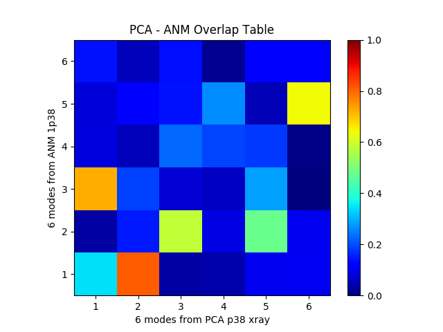
In previous page, we compared PCA and ANM modes to get some numbers. In this case, we will use plotting functions to make similar comparisons:
In [8]: showOverlapTable(pca[:6], anm[:6]);

# Let's change the title of the figure
In [9]: title('PCA - ANM Overlap Table');
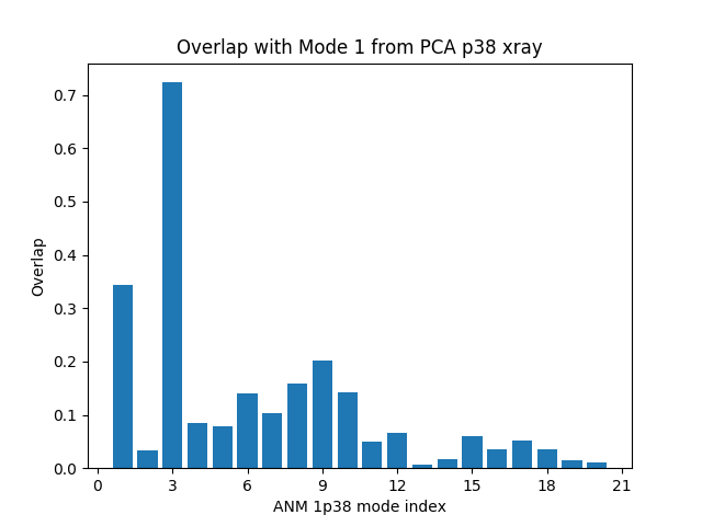
It is also possible to plot overlap of a single mode from one model with multiple modes from another:
In [10]: showOverlap(pca[0], anm);

Let’s also plot the cumulative overlap in the same figure:
In [11]: showOverlap(pca[0], anm);

In [12]: showCumulOverlap(pca[0], anm, 'r');
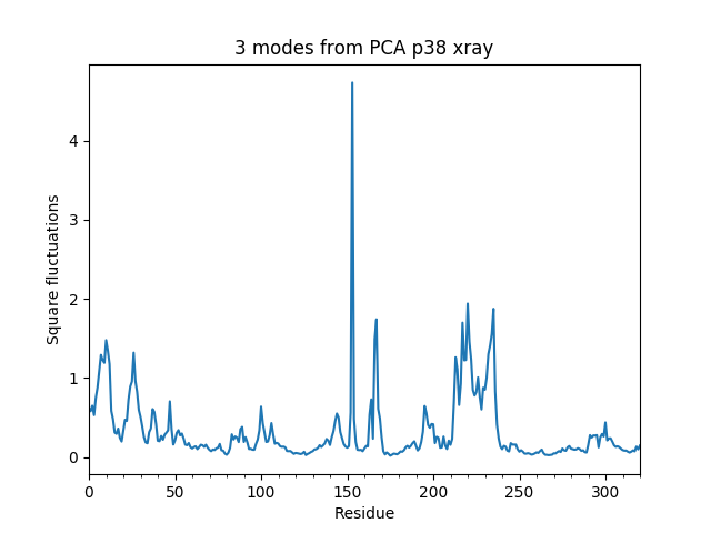
Square fluctuations
In [13]: showSqFlucts(pca[:3]);
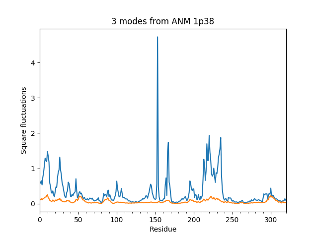
In [14]: showSqFlucts(anm[:3]);
Now let’s plot square fluctuations along PCA and ANM modes in the same plot:
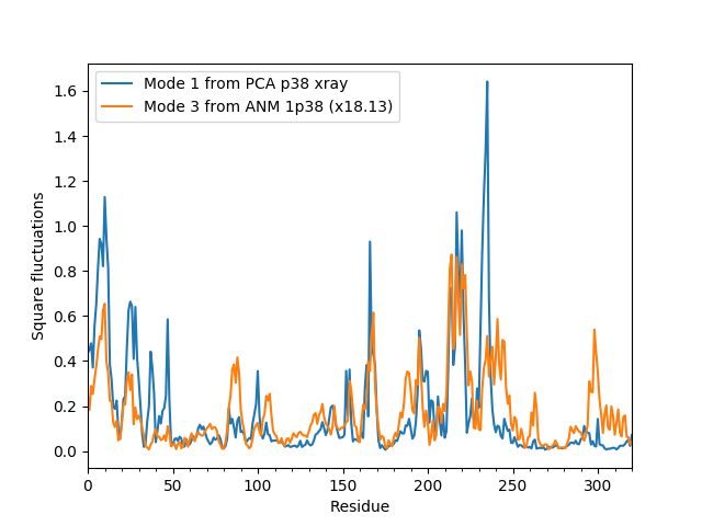
In [15]: showScaledSqFlucts(pca[0], anm[2]);

In [16]: legend();
In [17]: showScaledSqFlucts(pca[1], anm[0]);

In [18]: legend();
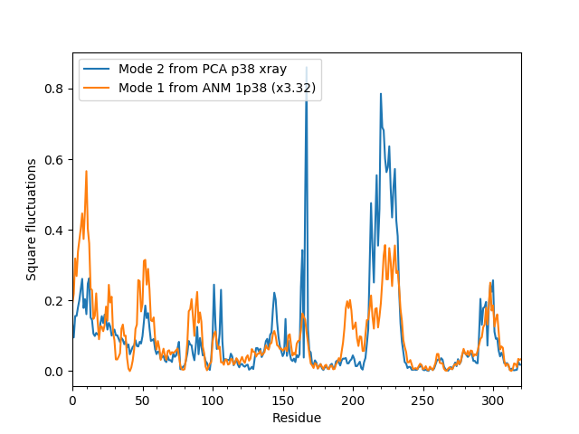
In the above example, ANM modes are scaled to have the same mean as PCA modes. Alternatively, we could plot normalized square fluctuations:
In [19]: showNormedSqFlucts(pca[0], anm[2]);

In [20]: legend();

Projections
Now we will project the ensemble onto PC 1 and 2 using
showProjection():
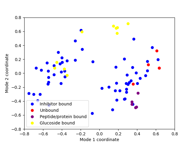
In [21]: showProjection(ensemble, pca[:2]);

In [22]: axis([-0.8, 0.8, -0.8, 0.8]);

Now we will do a little more work, and get a colorful picture:
| red | unbound |
| blue | inhibitor bound |
| yellow | glucoside bound |
| purple | peptide/protein bound |
In [23]: color_list = ['red', 'blue', 'blue', 'blue', 'blue', 'blue', 'blue', 'blue',
   ....:               'blue', 'purple', 'purple', 'blue', 'blue', 'blue',
   ....:               'blue', 'blue', 'red', 'red', 'red', 'blue', 'blue',
   ....:               'blue', 'blue', 'blue','blue', 'blue', 'blue', 'blue',
   ....:               'blue', 'red', 'blue', 'blue','blue', 'blue', 'blue',
   ....:               'blue', 'blue', 'blue', 'blue', 'blue', 'blue', 'yellow',
   ....:               'yellow', 'yellow', 'yellow', 'blue', 'blue','blue',
   ....:               'blue', 'blue', 'blue', 'yellow', 'purple', 'purple',
   ....:               'blue', 'yellow', 'yellow', 'yellow', 'blue', 'yellow',
   ....:               'yellow', 'blue', 'blue', 'blue', 'blue', 'blue', 'blue',
   ....:               'blue', 'blue', 'blue', 'blue', 'blue', 'blue', 'blue',
   ....:               'blue', 'blue', 'blue', 'purple']
   ....:

In [24]: color2label = {'red': 'Unbound', 'blue': 'Inhibitor bound',
   ....:                'yellow': 'Glucoside bound',
   ....:                'purple': 'Peptide/protein bound'}
   ....:

In [25]: label_list = [color2label[color] for color in color_list]

In [26]: showProjection(ensemble, pca[:2], color=color_list,
   ....:                label=label_list);
   ....:

In [27]: axis([-0.8, 0.8, -0.8, 0.8]);

In [28]: legend();
Now let’s project conformations onto 3d principal space and label conformations
using text keyword argument and PDBEnsemble.getLabels() method:
In [29]: showProjection(ensemble, pca[:3], color=color_list, label=label_list,
   ....:                text=ensemble.getLabels(), fontsize=10);
   ....:
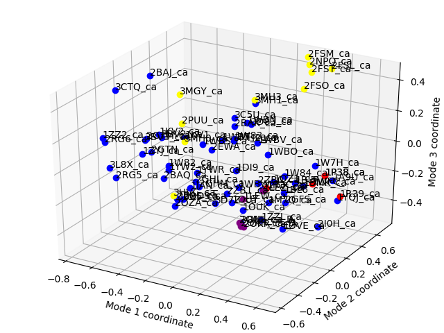
The figure with all conformation labels is crowded, but in an interactive session you can zoom in and out to make text readable.
Cross-projections
Finally, we will make a cross-projection plot comparing PCA modes and
ANM modes using showCrossProjection(). We will pass the scale='y'
argument, which will scale the width of the projection along the ANM mode:
In [30]: showCrossProjection(ensemble, pca[0], anm[2], scale="y",
   ....:                      color=color_list, label=label_list);
   ....:

In [31]: plot([-0.8, 0.8], [-0.8, 0.8], 'k');

In [32]: axis([-0.8, 0.8, -0.8, 0.8]);

In [33]: legend(loc='upper left');
In [34]: showCrossProjection(ensemble, pca[1], anm[0], scale="y",
   ....:                     color=color_list, label=label_list);
   ....:

In [35]: plot([-0.8, 0.8], [-0.8, 0.8], 'k');

In [36]: axis([-0.8, 0.8, -0.8, 0.8]);
It is also possible to find the correlation between these projections:
In [37]: pca_coords, anm_coords = calcCrossProjection(ensemble, pca[0], anm[2])

In [38]: print(np.corrcoef(pca_coords, anm_coords))
[[ 1.         -0.95443933]
 [-0.95443933  1.        ]]
This shows 0.95 for the PC 1 and ANM mode 2 pair.
Finally, it is also possible to label conformations in cross projection plots too:
In [39]: showCrossProjection(ensemble, pca[1], anm[0], scale="y",
   ....:     color=color_list, label=label_list, text=ensemble.getLabels(),
   ....:     fontsize=10);
   ....:

In [40]: plot([-0.8, 0.8], [-0.8, 0.8], 'k');

In [41]: axis([-0.8, 0.8, -0.8, 0.8]);